We're excited to feature a guest post by Dr. Grant Humphries. Dr Humphries is a seabird biologist by training and has been working with machine learning algorithms for about a decade. He is the lead web developer for the MAPPPD project, and currently runs a small data science company (Blackbawks data science) in the highlands of Scotland.
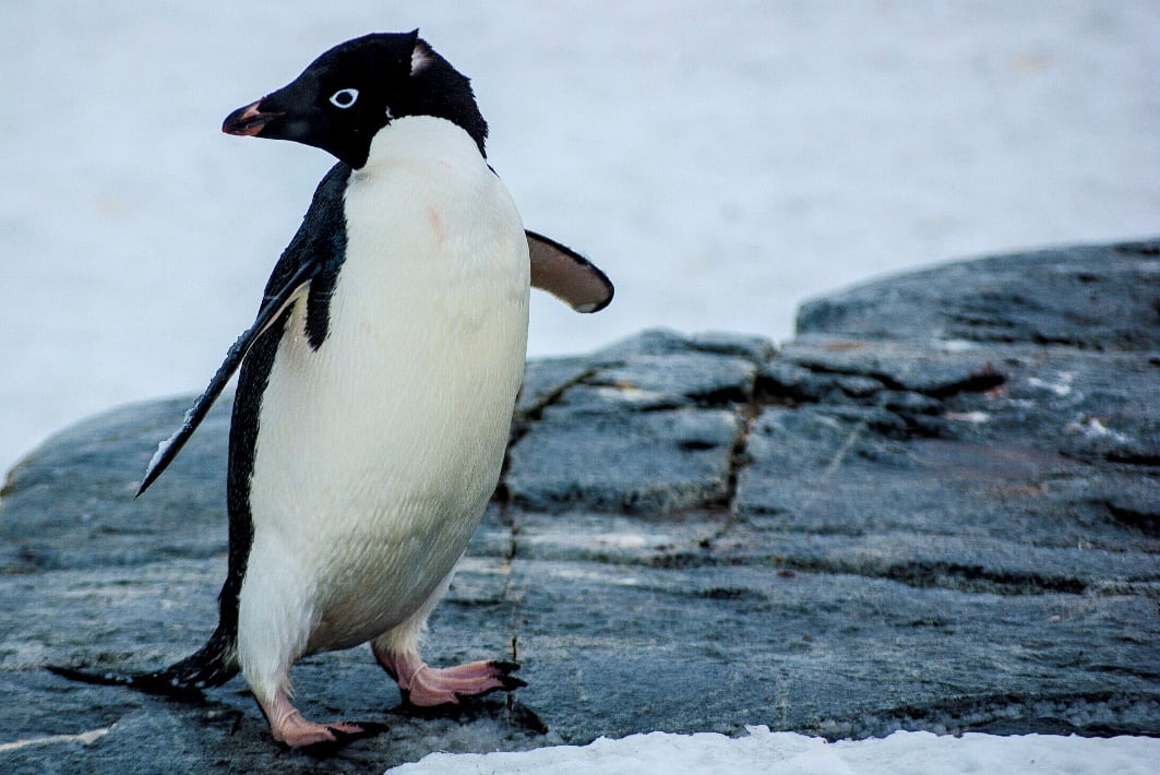
Antarctic penguins are some of the most well-known and charismatic megafauna on the planet. They have been popularised by their unusual behaviour and attitudes, which have been captured by wildlife videographers and scientists. Most people are probably familiar with them thanks to the soothing tones of Morgan Freeman's voice in "March of the Penguins", or the catchy music from "Happy Feet". Despite all the attention, there is still a lot we do not know about the four Antarctic penguin species; Adélie, Chinstrap, Gentoo, and Emperor penguins.
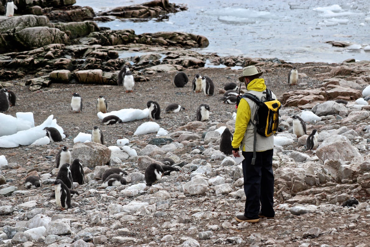
The goal of this data science competition was to reach out to the data science community to build a model that predicts penguin populations. The prediction of changes in penguin populations is important for the long-term management of these species, and important for understanding the entire ecosystem. The data we provided comes from a long-term (nearly 30 years) effort to monitor penguin populations, as well as other long-term datasets published by penguin researchers around the world. All the data used for the competition are freely available at MAPPPD.
The winning submissions were incredibly interesting, and helped to validate some known issues around population modelling of Antarctic penguins.
Not only did the data science competition demonstrate the use of algorithms not commonly applied in ecological studies, but it has also provided us with a suite of models that can be incorporated into ensemble model forecasts for the Antarctic conservation community.
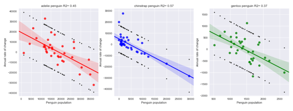
Though the winning approaches differed, a common theme emerged: the best predictors for abundance in the near future are the recent past, whether that be the previous year's abundance, trend over recent years, or in one case, approximate growth rate over time. On the one hand, this is not surprising, as the abundance of animals in a closed population are strongly auto-correlated. However, we were surprised at how difficult it was to find environmental covariates that improved model performance. Ecologists generally think animal abundances are controlled by environmental factors, since environmental conditions play a large role in where a species can be found. However, the link between those environmental factors that we can measure at large scale and abundance appears quite weak. There are many reasons why this might be.
One major reason is that our ability to measure environmental conditions over large areas is limited to what can be measured by satellites, and fine-scale phenomena, such as precipitation, may be more important that anything apparent from satellites. The second reason is that animal abundance is the net result of a multitude of factors that influence both survival and reproduction in the past, and so it is difficult to reverse engineer from the time series what factors may have played the largest role in the number of penguins arriving to breed each year. While ecologists have long struggled to understand these 'noisy' time series, this data science competition allows us to explore a massive number of alternative prediction approaches unbiased by our own "prior expectations" for how the system should work.
The results of the competition clarify several key issues for modeling time series of penguin abundance: 1) environmental drivers that can be measured at large spatial scales explain little year to year variation in populations, though extreme events (e.g., severe El Nino or unusual sea ice dynamics) might be detectable as a brief 'blip' in abundance; 2) In the short term (up to five years or so), the best predictions of population change are actually quite straightforward and can be easy integrated into management of marine resources. Moving forward, we advise greater caution in interpreting short term variations uncovered by regular monitoring of populations, since significant unexplained variation can mask long-term signals of change.
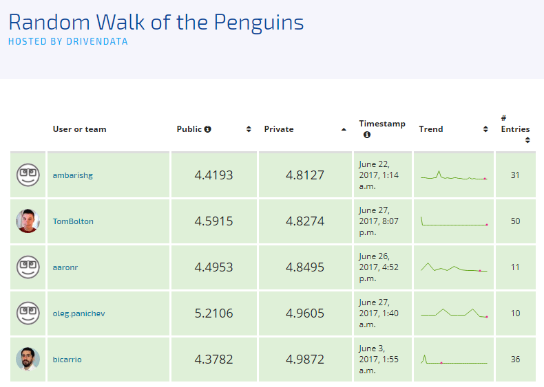
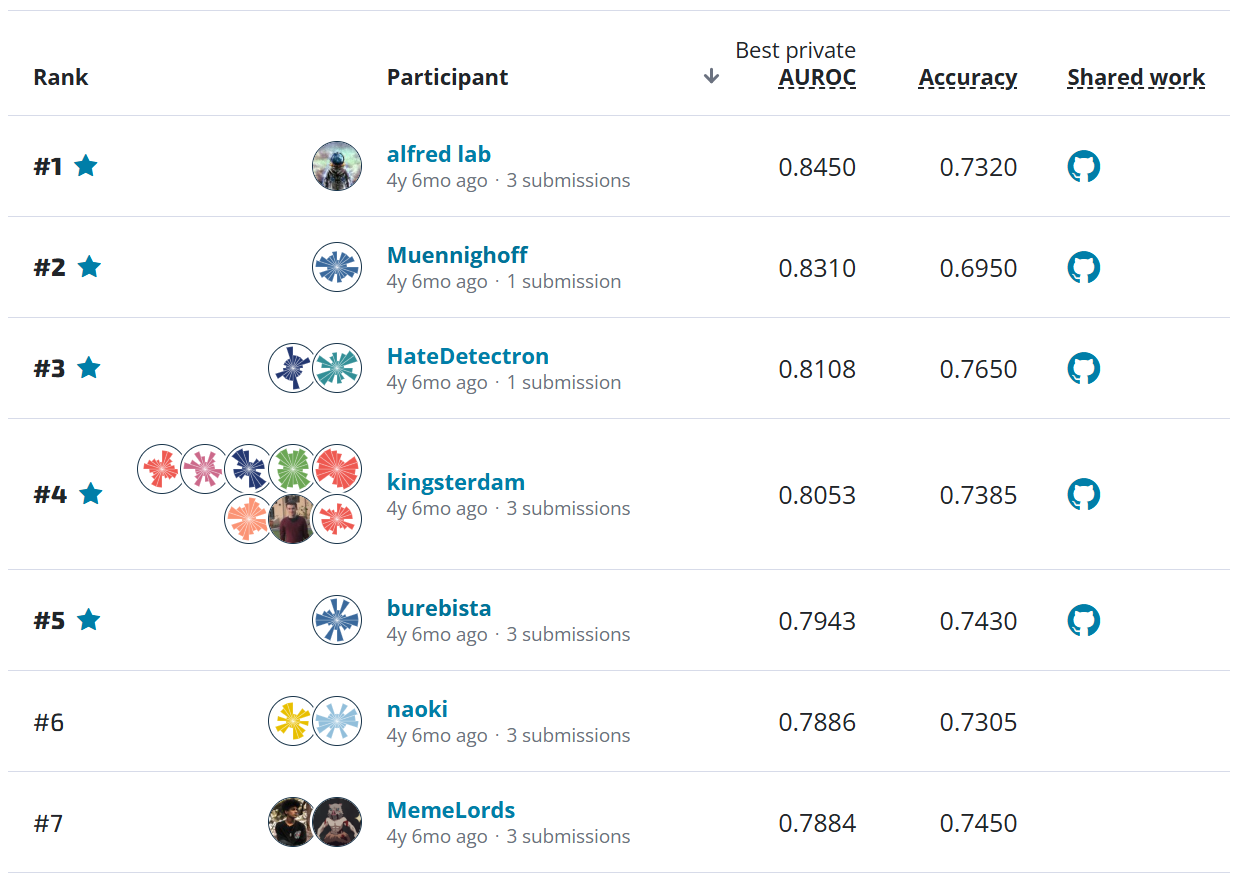
The benchmark set by DrivenData scored an 8.1101 % error based on the Adjusted Mean Absolute Percent Error (AMAPE). This was surprisingly higher than anticipated, but gave us a good place to start as submissions came through. The first-place submission nearly halved the AMAPE value, and we were excited to see many competitors managed to beat the benchmark. Over 600 models were submitted, and we would like to greatly thank all those who participated. The top five modelers submitted reports, and we list those below. From those, we selected two who provided interesting biological/ecological evidence for their approach.
Meet the winners
Ambarish Ganguly

Place: 1st
Ambarish's background: I am an IT consultant with around 18 years of industry experience. For the last 10 years, I have been consulting with utility (electricity, gas and water) companies around the globe in USA, Canada and Australia focusing on energy trading, customer care and billing and home services. I am a self-confessed MOOC addict ☺ enrolling myself in more MOOCs than I can ever complete.
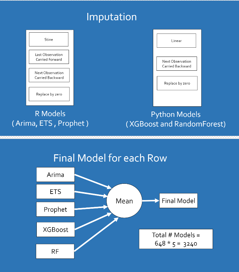
Method overview: The solution is divided into 2 major parts - Imputation of the data - Model Building
Imputation of the data - Before running the model, imputation of the data was done for each of the site and penguin type combinations. The imputations were done in the following order - Stine in case of R models and Linear in case of Python models - Last Observation Carried Forward in case of R models only - Next Observation Carried Backward in case of R and Python models - Replace by Zero in case of R models and Python models
Model Building - Built 5 models for each of the site and penguin type combination. Therefore for each of the 648 combinations of site and penguin type, the following models were built - XGBoost in Python - RandomForest in Python - ARIMA in R - ETS in R - Prophet in R
An average for all of these models was created for every 648 combinations.
Thomas Bolton

Place: 2nd + panel selection winner
Background: My name is Tom, and I'm currently a physics PhD student at the University of Oxford. My research is in physical oceanography, in particular Gulf Stream turbulence. My day-to-day work involves statistical analysis of observational datasets and model output, as well as some theoretical approaches. In my spare time I'm a keen cyclist.
Method: My method involved a mix of persistence, auto-regressive models, linear regressions and exponential models. As the challenge involved multiple time series, the particular method applied depended on my judgement, after manual inspection of the data. Tailoring the approach for each time-series individually proved successful as opposed for a single technique across all of them. The behaviour of the time-series varied massively between sites and species. One time-series might show a linear increase due to increased food availability, where a neighbouring site may exhibit exponential decrease due to humans entering the region; with so many potential factors affect the inter-annual variability of nest counts, it made the challenge particularly difficult.
Aharon Ravia

Place: 3rd
Background: I am Aharon Ravia, 32 years old from Israel. Currently, a PhD candidate in the neurobiology department at the Weizmann Institute of Science, studying computational models for human olfaction (the sense of smell). Throughout my academic and professional career, I have studied math & neuroscience and was employed as a data scientist, and as a data science team manager. I am also a huge fan of penguins, watched them in Australia and New Zealand, but had not yet been to Antarctica.)
Method: My first entry to the competition was late, less than 2 weeks before the deadline. As I have seen the amount of the data, which was quite sparse, I thought that there is not much time to go beyond simple methods. My experience with time series data had thought me that the best estimation for next step change is 0. So I predicted the last known result for each location as the estimation for the years not revealed. Astonishingly this approach alone did quite well and resulted is 16-20 place in the leaderboard. This thing has thought me few things, the first, that it was also significantly better than the linear fit solution, and many other submissions, so significant that I ruled out (almost completely) the possibility that it won't be the case on the private leaderboard set. In addition, the AMAPE estimation I had on my training set was so far away from the result on the leaderboard set, that I realized I have to relate carefully to my validation result.
I wanted to further combine in the model 3 different type of models. The first is estimation of the mean, which is done by last estimation (could be done as an average of last N observations). The second is a recent trend, changes in recent years. The third is the whole time series trend. This approach was partially adapted from Facebook's Prophet blog post. I also wanted to study more from the public leaderboard set (with a risk of overfit) whether there was an additional general trend of increase/decrease that years. Eventually I combined the constant estimation, with a minor general trend and a linear fit that was computed differently for each year.
Oleg Panichev

Place: 4th
Background: Last seven years I am working in the field of mathematical analysis of biomedical signals. The most interesting topics for me are a study of work of human brain and artificial intelligence. I believe that machine learning and artificial intelligence are one of the key technologies of our future. Last 3 years I am working on a Ph.D. thesis which is devoted to the prediction of epileptic seizures based on EEG analysis. Currently, I am working as a research engineer in R&D lab in Ciklum.
Method: My approach is based on Benchmark: Simple Linear Models – this is a great starting point for this problem. The first what I did is replaced of Linear Regression with XGBoost and minor parameters tuning. After that, I have looked around the preprocessing part and decided to improve function for replacing NaNs in the dataset. Actually, that didn't give any improvements but allowed to combine different models into an ensemble. Submission generated by ensembling of previous submissions resulted in 5.2132 on the public leaderboard and 4.9605 on the private.
Benjamin Carrión

Place: 5th + panel selection winner
Background: My name is Benjamin (Ben) Carrión. I hold a bachelor degree in hydraulic engineering and a Master of Science on coastal engineering. I work mostly as numerical modeller of coastal hydrodynamics and morphodynamics for a port and coastal consulting company (PRDW). As a result, I code and deal with data regularly. I'm quite new to the data science world, formally, but I wanted to see how far could I make it (in the competition) with my current background.
Method: The key element to realize is that, at least in this particular case of seasonal breeding in a rather extreme ecosystem, what you really want to estimate is the annual rate of change of populations rather than the actual populations.
My thought was that populations are in a delicate equilibrium between competitors, preys, and predators, which can be written down using differential equations, on which the absolute rate of change between breeding seasons (birth rate minus death rate) depends in some complex way on the other species' populations.
This differential system can be solved and the levels of different populations will change until an equilibrium is reached. However, given the seasonal character of Antarctica, the "time step for the integration", sort of speak, of these equations is fixed, and could be too large to reach smooth equilibrium. Instead, the population levels oscillate seemingly at random, but around a certain equilibrium value.
This might seem far-fetched, but it is (somewhat) what happens with lemming populations in Canada. The idea of "suicidal lemmings" arises from the large variations in their population from season to season. In the particular case of lemmings what happens is that they food (plants) grows at a slower rate than the lemmings are born. So, high natality increases the lemming population, which depletes their food supply, which doesn't grow as fast, so many lemmings die. This is a very rough sketch, but illustrates the idea. Specifically, it shows that the overall rate of change seems to depend largely on the previous' year population.
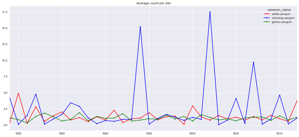
Now, for the case of the penguins it is hard to see any trend at all per nest, given the patchiness of the dataset. Some sites might have only a few observations, or even only one. Moreover, fewer observations were available for previous years too deep in the past. The dataset is far from homogeneous, and any method to fill it up might include large errors. Also, it wasn't clear that certain penguin types favoured larger or smaller groups: you could find some nest of a certain type with a few dozen individuals, or other nest of the same penguin type with a few thousand ones, even for close locations. In that regard, location didn't seem very relevant either.
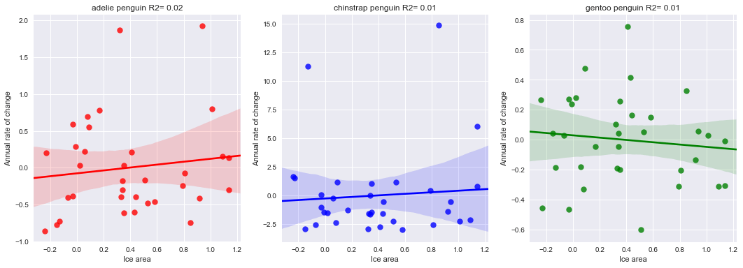
However, if the mean count per penguin type are considered, trends are more visible: large variations around a rather stable average value. This is my main hypothesis. Now, the actual rates are still quite noisy, but correlate well with the average mean population per site per penguin type of the previous year. Correlation with other environmental variables, such as ice extent or water/air temperature was not clearly seen, since these parameters also present a rather noisy behaviour (over a small mean trend: rising both temperatures and ice extent).
The train of thought was to forecast a mean rate per penguin type, and apply it at each site, using the last valid measurement. In fact, if you consider a rate of change 1.0, i.e. no change from the last valid value, you already get a good estimate for the future year populations. This indicates that (mean) rates seem to be rather close to 1.0, and what you should aim for is a method to estimate the deviation from that value, for each forecasted year.
Thanks to all the participants and to our winners! Special thanks to NASA for supporting the MAPPPD project and this data science competition. Thanks also go to Dr Heather Lynch, who obtained the original funding for the MAPPPD project and offered input on this post, and to Ron Naveen, the President of Oceanites who has dedicated much time and effort into MAPPPD and Antarctic conservation. We look forward to working with the winners as we further analyse the model output.