Water in southwest Morocco is highly valuable because of the semi-arid climate and lack of accessible water sources. Fetching water is a difficult task. Women and girls spend up to four hours a day to collect poor quality water and carry the barrels back to their communities.
Dar Si Hmad (DSH) works with community members to alleviate this shortage by harnessing clouds. Featured in the New Yorker this spring, DSH manages a network of nets that collects fog coming over nearby mountains and disseminates the fresh water to landlocked Berber communities.
Through this approach, DSH had assembled years of data about weather patterns and water yield. In partnership with the Tifawin Institute and Tableau Foundation, DrivenData ran an online tournament to put this data to use. Participants were given two tasks: predict how much water DSH can expect in the future, and create clear and insightful ways to visualize the collections system. More than 500 people answered the call and signed up for this challenge!
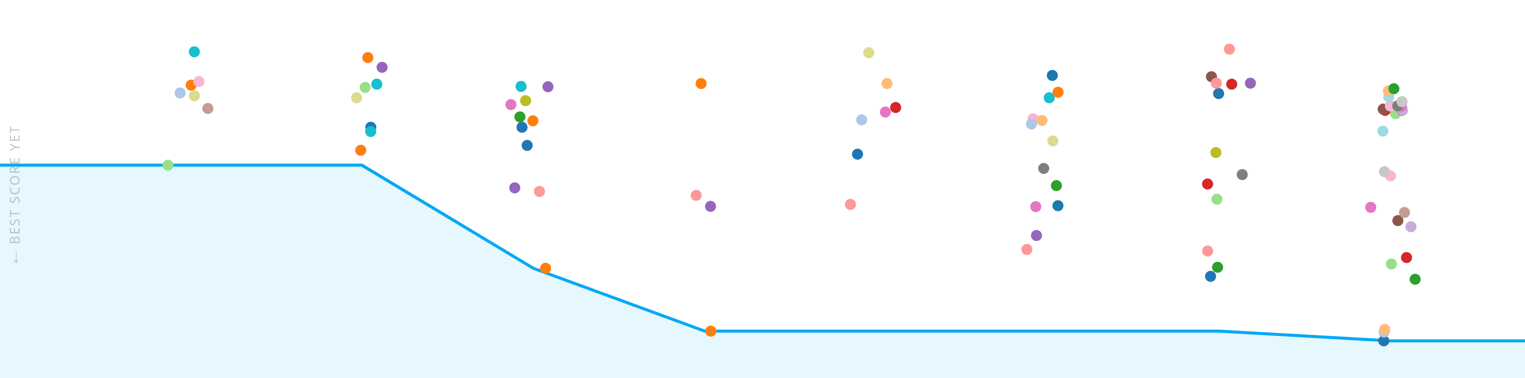
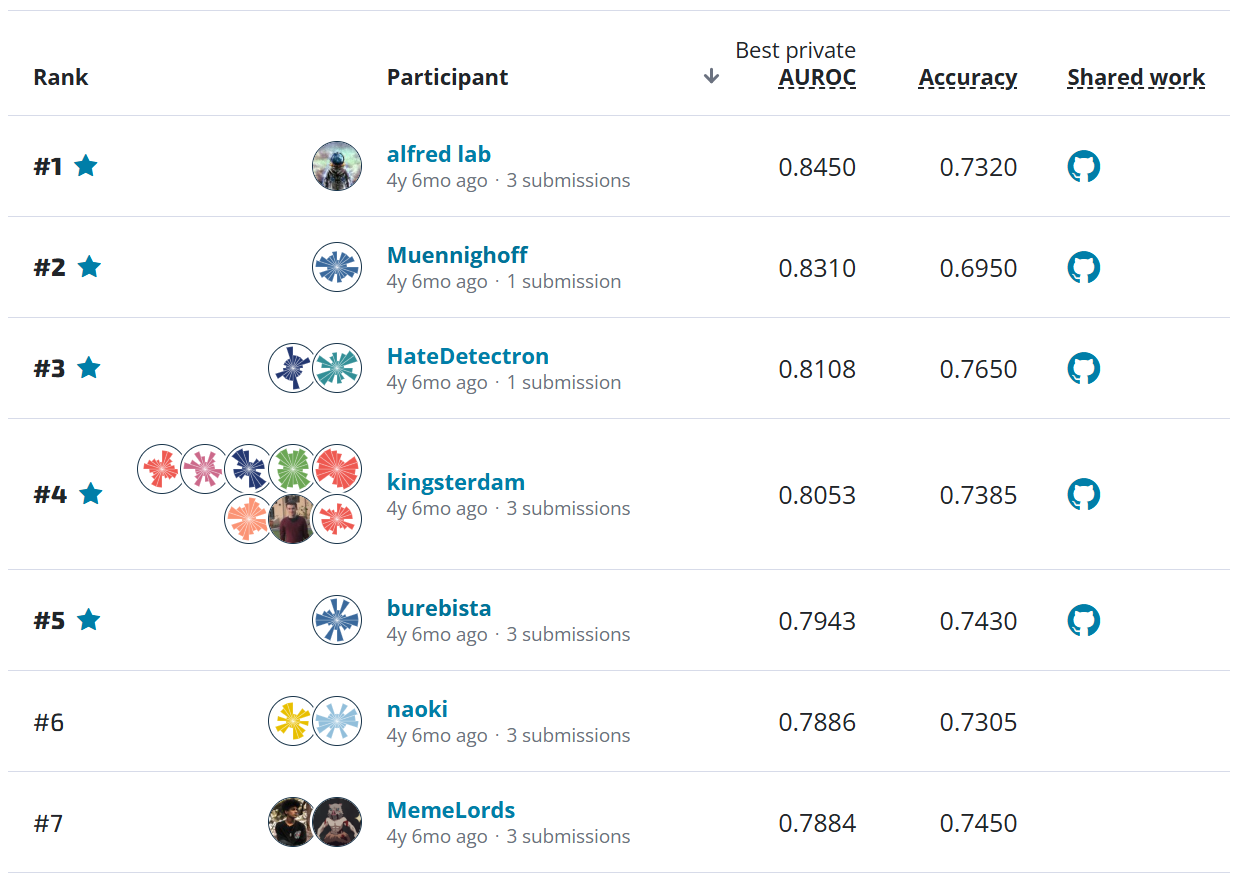
Graph of submissions over the course of the competition. Lower scores reflect better, more accurate performance.
Not only were the visualizations evaluated by a panel of experts, they were also used to foster new conversations with members of the communities that DSH serves (as seen above). We awarded prizes to the visualizations that resonated most with the community during those conversations (Community Voice Award) and that drove greatest clarity and insight for experts (Expert Panel Award).
Meanwhile, the most accurate predictive models were awarded and released under an open source license for all to use and learn from. These will help DSH get a better view into how much water its fog nets will contribute to alleviating the shortages that persist going forward.
We talked to the top competitors from the visualization and modeling challenges to get to know them and understand how they managed to solve the problem.
Meet the winners of the Visualization Challenge!
Hamid Hajebian
Expert Panel Award
Home base: Austin, TX
Hamid's background: I have a psychology degree from the University of Kansas. I'm an analyst at Whole Foods Market, in Austin, TX. Most of my work consists of automating reporting processes, developing analytical tools, and creating data visualizations.
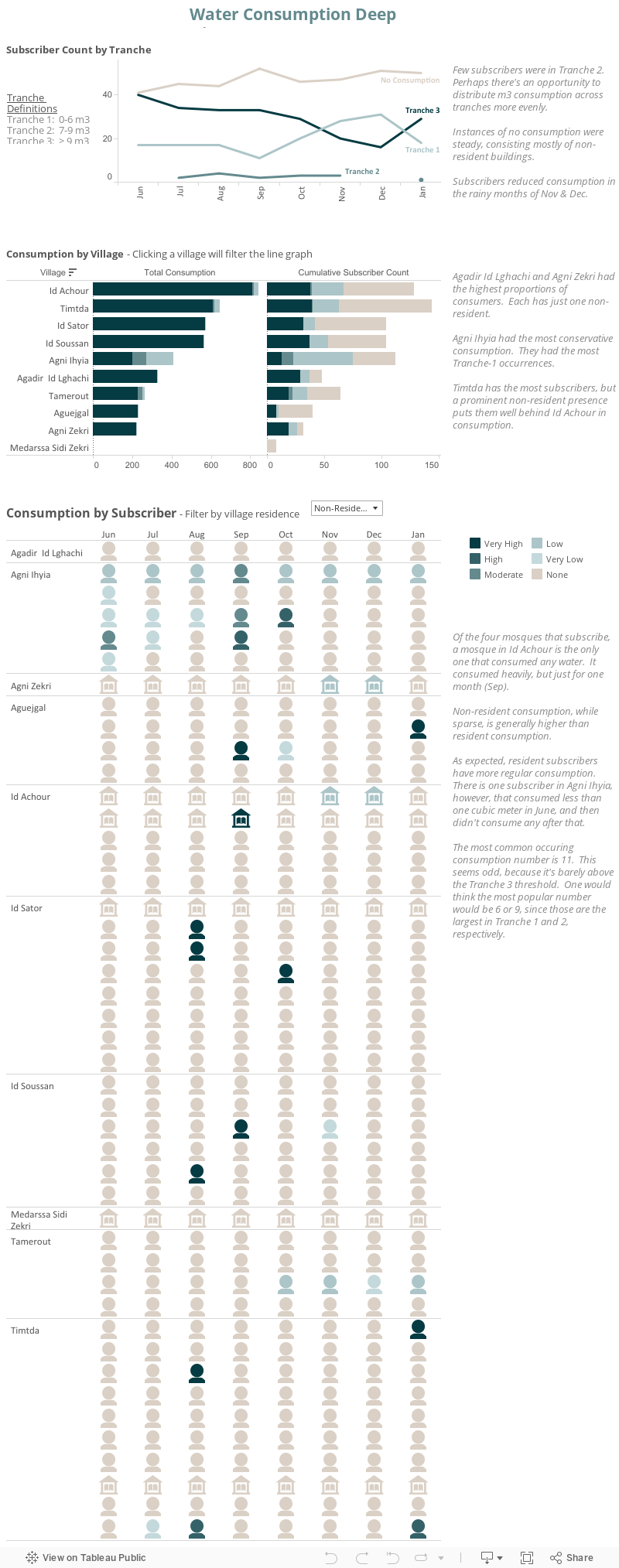
Method overview: I sliced and diced the dataset in many different ways before I settled on what I wanted to show. The first thing that struck me was the tranche distribution -- it seemed that tranche 2 was relatively scant. The next thing was consumption patterns, or lack thereof, between residents and nonresidents.
Regarding layout, I wanted there to be a progression of granularity and insight, accompanied by my own annotations. It seemed natural to 'break the ice' by showing usage over time, offering the obvious finding that consumption decreases during rainy months. Then, I wanted to go a bit deeper by showing each village's consumption and enabling the village to filter the line graph. Then, I tried to imagine what a user involved with the project might ultimately want to see, so I showed every subscriber's consumption by month, grouped by village and residence status. I thought it allowed a user to see not only how nonresident consumption differs from resident consumption, but what interesting patterns or outliers there may be.
Hamid's Visualization:
Rudolph Broomes
Expert Panel Award, Community Voice Award
Home base: Lisbon, Portugal
Rudolph's background: I'm originally from Barbados, itself a water-stressed country. Over the past decade, I worked in the tech sector in Philadelphia across a variety of roles, most recently as a project lead. After completing my MBA in France two years ago, I transitioned into more business-oriented roles and work independently as a strategy consultant/data analyst.
Method overview: I researched the wider problem of global water scarcity, then narrowed my focus to examine what Dar Si Hmad was doing to solve the problem locally. What stood out in all the newspaper articles was the impact this project had in improving quality of life, especially for the women in the village. The village women and girls were responsible for water-gathering chores that could take up to 3.5 hours every day. Reclaiming this 3.5 hours meant more time for education or to spend with their families. Thus I decided my visualization storyline should highlight the number of "woman-hours" saved in each month by having running water installed in their villages.
Afterwards it was the typical technical procedure of exploratory analysis, data cleansing and reshaping the data. One connection that I really wanted to make was between the prevailing weather patterns, the fog net water yields and the subsequent water consumption per village. However, the water yield was unit-less so I ended up removing that from the visualization and sticking to the main storyline of woman-hours saved.
Rudolph's Visualization

Nai Louza
Expert Panel Award
Home base: London, United Kingdom
Nai's background: Nai Louza is a data analytics specialist, with a postgraduate degree from the University College London. As a data analyst with The Information Lab, Nai has collaborated with clients in a variety of industries ranging from pharmaceuticals to community support work. She has provided actionable insight by cleaning, preparing, and visually presenting data, analysing and identifying underlying narratives and trends. Her tools of the trade are Alteryx and Tableau, and she has earned qualifications with both. Nai's interests include analysing data that contributes to our understanding of human motivation, successful performance, and social solutions.
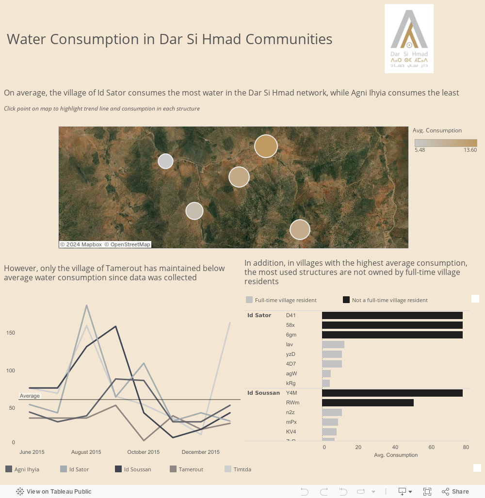
Method overview: I approached this dataset the way I approach any dataset - by first outlining who my audience is and what the purpose of the visualisation would be. It's very tempting to dive right into a dataset as soon as you get your hands on it, but even just a couple of minutes brainstorming through questions of who, what, and why make the analysis a lot smoother.
In this case, I wanted to give the Dar Si Hmad organisers a snapshot of what is currently going on with water consumption in their communities. Although I'm not fully familiar with the work that goes on behind the scenes, I tried to highlight interesting pieces of information that stood out to me, like how the most used structures are not owned by full-time village residents. My hope was that this would lead people to ask more questions, and try to ascertain the "why" behind these interesting observations.
Nai's Visualization
Ankur Kumar Gupta
Community Voice Award
Home base: New Delhi, India
Ankur's background: I am working as a Business Intelligence Analyst. Currently I am associated with Disney and working in customer engagement analytics department.
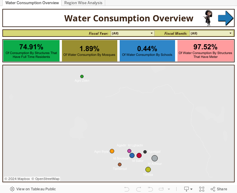
Method overview: My approach was first to define a problem description. As in this case which channels have the maximum water consumption and which months have higher water consumption over the year. Then I used the best practices of Tableau to design the charts. The purpose of doing that is to present the compelling story to the users and they get benefited by the information dashboards are providing.
Ankur's Visualization
Meet the winners of the Prediction Challenge!
Bradford Tane Ulery
Home base: Fairfax, VA, USA
Bradford's background: I started programming in the 1970s on my Dad’s HP calculator (up to 50 instructions) and a big terminal with ink and lined paper that my mother sometimes brought home in its suitcase from the university. I took my first programming course at the Univ. of Delaware and spent long summer nights programming on the PLATO system, which offered graphics, touch-screens and music. After exploring other topics at Carleton College, I returned to computer science as a graduate student at UCLA, then UMD. Lately, I’ve mostly abandoned programming and turned to data analysis and statistics in the context of biometrics research.
Method overview: I developed the models initially in JMP™ 12 because I’m familiar with that, didn’t have any great alternatives, and happened to learn about the contest a couple weeks after it started. Knowing I would have to provide my solution as open source, I limited myself to using ordinary least squares regression. I spent a lot of time visualizing the data to understand what was going on, get an intuitive sense for pattern vs. noise, and to select some thresholds. Soon I decided that winning would require dotting i's and crossing t’s, so I invested a lot of effort setting things up (e.g., imputing missing values).
I tried various approaches and gradually learned; I submitted many entries. Eventually, after discovering strengths and weaknesses of the data and better understanding the gaps (missing data), I decided to make a single macro model by building a foundation of X variables that was much more complete than what was provided: more than just simple imputing, I forecast the variables I needed, especially through the night when some of the best variables were not reported. As a result, I needed only two models, macro and micro, rather than multiple macro models which was where I started (different models to match whichever combination of data sources was available for a prediction)...
I relied heavily on intuition and just playing in the data. The best method I used was simply plotting the predictions against the actuals against time on the x-axis. I polished that a bit with some standard labeling, splitting the long timeline into sections, overlaying markers indicating where the training sets were, etc. When predictions were off, I tried to track down variables that could be used to improve the model; typically, I’d focus on a brief weather event and try to discover clues as to why I had not predicted it accurately.
Lamia Z
Home base: Paris, France
Lamia's background: I am generally interested in data analysis, and seeking original ways to understand complex systems.,having first started doing so in computational biology. What drew me in particular to this competition was the fogwater project that I had previously heard of, and that I find really exciting.
Method overview: I used a random forest algorithm, with some feature engineering. I used only microclimtate data when it was available and macroclimate data from guelmim when it was not, notably cloudiness, humidity, temperature, wind data and temporal variables like day of the year and hour of the day. For circular values, like day of the year or wind direction, I used the cosinus and sinus transforms. I imputed missing values in microclimate and macroclimate data by using the last seen value so as not to pollute with future data. I trained and predicted separately each subset of the test set, using for subset between times t1 and t2 the training set available for t<=t1.
Olivier Bernard Alain Schiavo
Home base: Paris, France
Olivier's background: I am a software engineer.
Method overview: The main issue for this problem is incomplete data. I made a program which allows to easily build some "mini models" which use only a part of the data and different aggregation techniques, and then choose the best performing "mini model" for each line of the submission.
I fixed the grouping function in order to not inject future data. I tried mlp instead of xgboost. I did other "mini model" trying to specialize them even more: "night" models for example.
Thanks again to all of our awesome participants, and congratulations to our winners! We hope you enjoyed getting to know them.
Finally, we'd like to extend our deep gratitude to Tableau Foundation, Tifawin Institute and DAR SI HMAD for their amazing support in sponsoring the competition!
|
|
|

|
|