Classifying Penguins
When we use classification algorithms, sometimes we don’t really care about the classifications; we care about how classifiable the categories are. An example is the now-ubiquitous penguin dataset, which was collected as part of an ecological study at the Palmer Station in Antartica.
One of the goals of this study is to classify male and female penguins using physical measurements like body mass and beak size. With just a few of these “morphological predictors”, they “correctly classified a high percentage of individuals from independent datasets (i.e., 89–94%).”
For people who are not experts in this area, it’s not obvious why this is useful. After all, the dataset includes the sex of each penguin, which was determined by DNA analysis during the same examination that yielded the measurements. So why are they guessing at something they already know?
The reason is that they are trying to quantify the degree of “sexual size dimorphism”, that is, how different males and females of the same species are. And quantifying dimorphism is useful, according to the paper, because it is related to foraging behavior and habitat quality.
The classification algorithm they use is logistic regression plus information-theoretic methods for feature selection. This algorithm is appropriate to the goal of the paper: if a simple algorithm based on a few features achieves high accuracy, we can conclude that these species are strongly dimorphic. So the researchers use classification accuracy to quantify dimorphism.
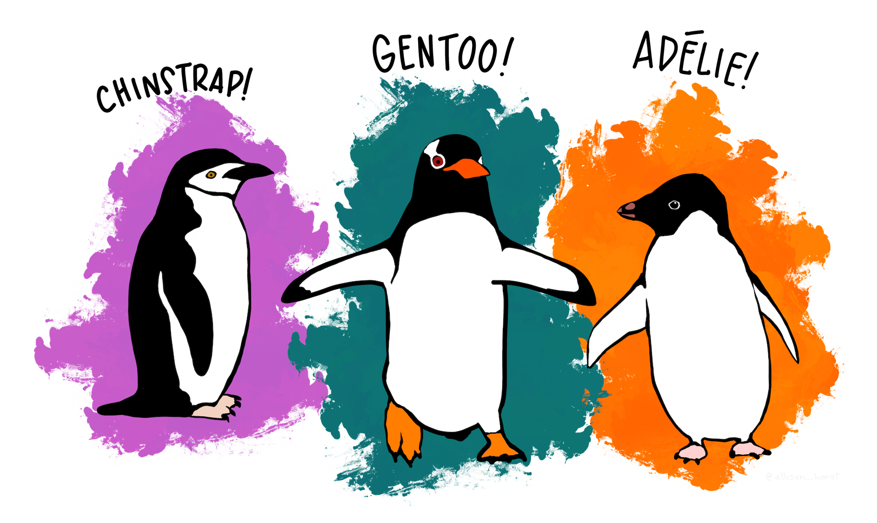 Artwork by @allison_horst
How Classifiable Are They?
Of course, additional features might improve the accuracy of the model, or another algorithm with the same features might do better. So the accuracy of a simple model establishes a lower bound on dimorphism, but doesn’t rule out the possibility that the degree of dimorphism is actually higher.
This a question that comes up all the time in machine learning: How well can we do with the data we have? Even when we have a result, it can be hard to tell if it's a good result. What more could we do with better approaches? Or are we already close to the upper bound?
Suppose we repeat this experiment with another species and find that the accuracy of the model is substantially lower, like 60% (remember that we can get 50% by guessing). In that case, we might conclude that the new species is less dimorphic, but we would not be sure. Another algorithm, or different features, might make better predictions. However, by testing additional algorithms and features, we might be able to make inferences about the upper bound.
For example, suppose using another algorithm on the same dataset increases accuracy to 65%, and adding an additional feature increases accuracy to 70%. If changes like these yield large improvements, we might suspect that we have not yet reached the maximum possible accuracy.
On the other hand, suppose we augment the dataset with a large number of physical measurements and run a data science competition where multiple teams test a variety of algorithms for several weeks. If, at the end of all that, the accuracy of the best model is only 63%, we might conclude that we are close to the upper bound.
In the first case it is still possible that the species is strongly dimorphic; in the second case we can conclude with some confidence that it is not.
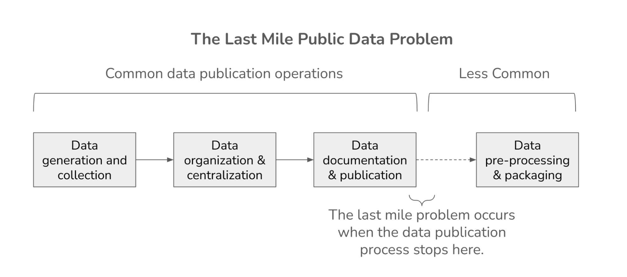
This example demonstrates a possible role for machine learning competitions in science: they establish a lower bound on model performance and provide some evidence about the upper bound.
So that’s useful, but maybe we can do better: maybe we can use results from a data science competition to estimate the upper bound quantitatively. In April 2022, we presented a talk at ODSC East, called “The Wisdom of the Cloud”, where we presented an experiment we ran to test this theory.
The View From the Leaderboard
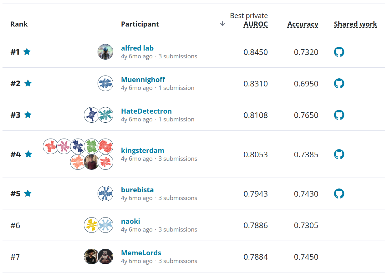
During a competition like the ones hosted by DrivenData and Kaggle, the leaderboard lists the teams that have submitted predictions and the scores the top models have achieved. As the competition proceeds, the scores often improve quickly as teams explore a variety of models and then more slowly as they approach the limits of what’s possible.
For example, here are the results from a practice competition called “Naive Bees Classifier”, which asked competitors to classify images of honey bees and bumblebees. The x-axis shows the days of the competition; the y-axis shows the quality of the predictions in terms of log loss (so a lower score is better). Each dot shows one submission; the solid blue line shows the score of the best submission so far at each point in time.
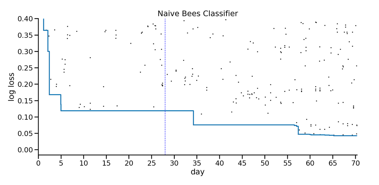
In the first few days, the best score improved substantially, from 0.4 to 0.12. That record stood for almost a month, and then the new record stood for several weeks. During the last week there was a flurry of small improvements.
Looking at this figure, what do you think would happen if the competition ran for another month? To me, it seems like there might be some additional room for improvement, but maybe not much, or maybe it would take a long time to find it.
Now let’s see if we can quantify this intuition. In our experiments, we explored two ways to estimate the upper bound on the accuracy of the model, which is the lower bound on log loss:
-
By ensembling the best 2-3 models, we can see how much potential for improvement remains.
-
By modeling the progression of new records, we can estimate the asymptote they seems to be converging on.
We describe the first approach in the next section and the second approach in the next blog article.
Ensembling
In general, ensembling is a way to combine results from multiple models; for example, if you have classifications from three models, you could combine them by choosing the majority classification. In practice, ensembling is often surprisingly effective.
At any point during a data competition, we can choose some number of submissions from the leaderboard and ensemble the results. If the ensemble is substantially better than the individual models, that suggests that there is still room for improvement; if the ensemble is not much better, that suggests that the best models are already close to the limit.
The following figure shows the results from the Naive Bees competition again, this time with red circles showing the result of ensembling the best two models each time a new record is set. The vertical dotted line shows the point we used to evaluate our method, explained below.
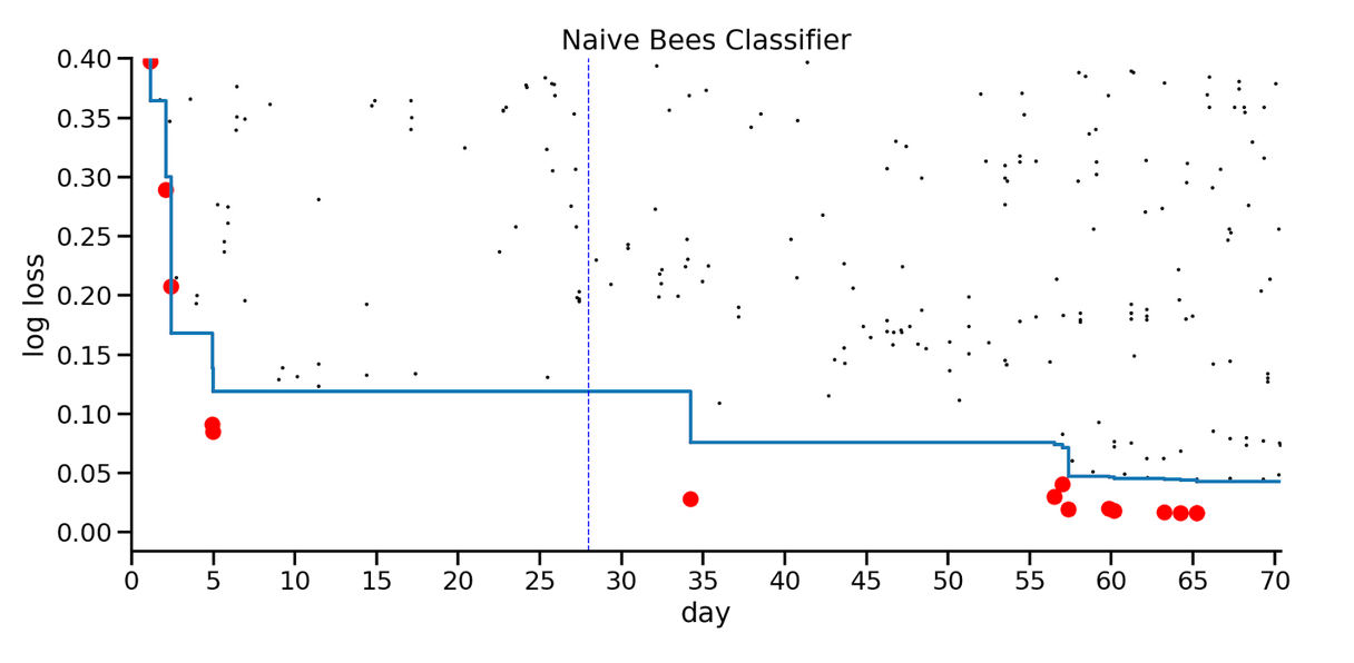
The distance between the blue line and the red dots indicates potential for improvement, assuming that the ensemble can incorporate the strengths of the top models. In this example, even at the end of the competition, the ensemble is substantially better than the best individual model, which suggests that the scores would have continued to improve if the competition had run longer.
In contrast, here are the results from another competition, which involved predicting poverty at a household level.
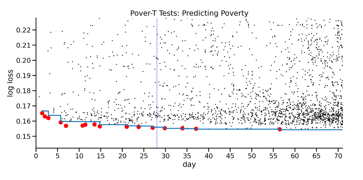
During the first few weeks, the ensemble suggested that there was room for improvement, and that turned out to be true. But after Day 30, there was no visible room between the blue line and the red dots, and there was almost no further improvement in performance.
Based on these two examples, at least, it seems like ensembling provides useful information about remaining room for improvement.
However, one drawback of this approach is that it produces a point estimate for the lowest score, with no indication of uncertainty. In the next post, we'll consider another approach that produces a distribution of possible lower bounds.