In the previous post, we suggested that machine learning contests can be useful for some scientific projects by quantifying how well a set of categories can be classified. As an example, we mentioned the project that is the origin of the beloved penguin dataset, which was used to quantify sexual dimorphism in different species.
At any point in time, our best model puts a lower bound on how well the categories can be classified -- but it doesn't tell us much about the upper bound. To estimate the upper bound, we have explored two methods. The first, which we presented in the previous post, is to ensemble several of the best models and see how much improvement we get from ensembling. The second, which is the subject of this post, is to model the progression of record-breaking scores.
Modeling the progression of records
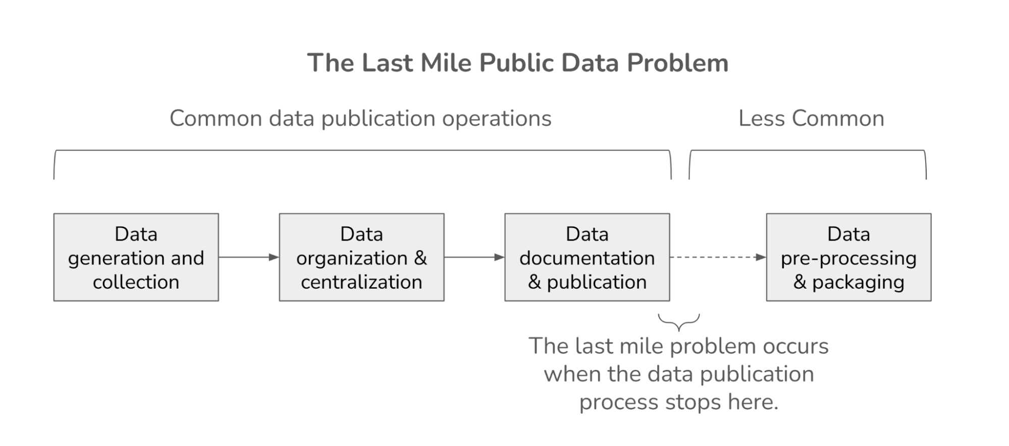
Suppose we develop a series of models for a classification problem, use each model to generate predictions, and score the predictions using a metric like log loss. We can think of each score as the sum of two components:
-
A minimum possible error score, plus
-
An additional penalty due to limitations of the data and the model.
We call the minimum possible score the "aleatoric limit", which indicates that it is due to chance, and the additional penalty "epistemic error", which indicates that it is due to imperfect knowledge.
To get a sense of the aleatoric limit and the distribution of epistemic errors, let’s look at the distribution of scores from one of the practice competitions at DrivenData; the following figure shows the cumulative distribution function (CDF) of scores from this competition on a log scale.
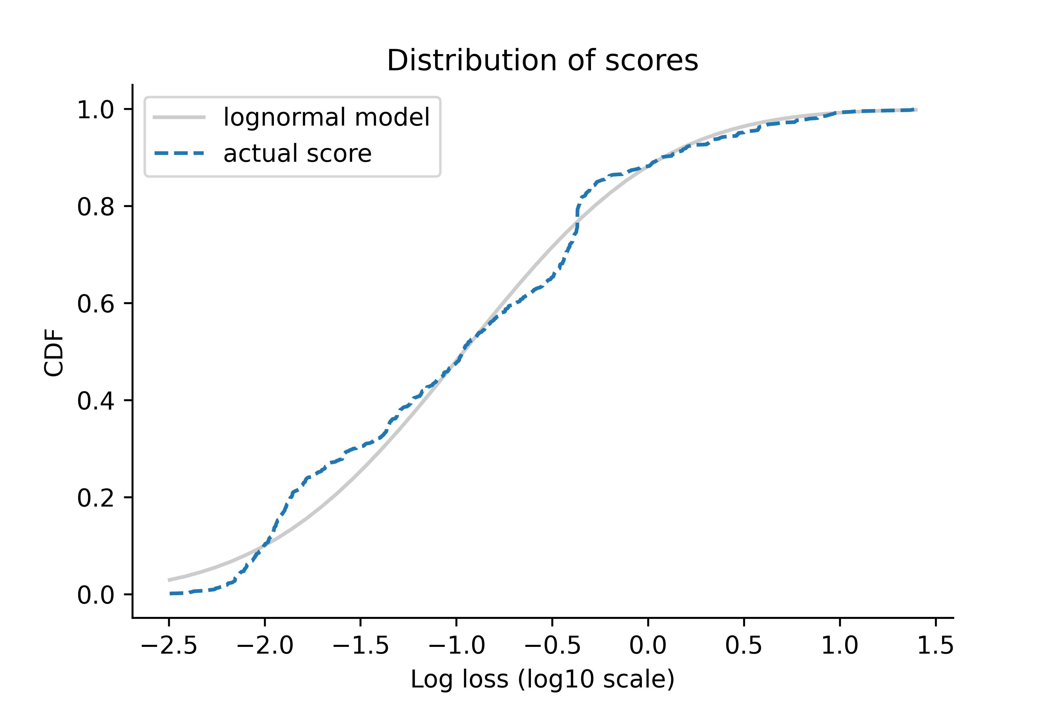
The logarithms of the scores follow a Gaussian distribution, at least approximately, which means that the scores themselves follow a lognormal distribution.
This observation suggests a way to use observed scores to estimate the aleatoric limit: by fitting a three-parameter lognormal distribution to the data. More specifically, we assume that each observed score is the sum of the aleatoric limit and a random error:
$$\mathtt{score} = \mathtt{limit} + \mathtt{error}$$
And that the log-transformed errors follow a Gaussian distribution:
$$\log(\mathtt{error}) \sim \operatorname{Gaussian}(\mathtt{mu}, \mathtt{sigma})$$
If we estimate the parameters of this model -- limit, mu, sigma -- we can use limit to estimate the lower bound of the error, and all three parameters to predict future scores.
However, there’s a problem with this approach: as a data competition progresses, the best submissions are usually close to the current record, but some are substantially worse, and some are way off. The close ones provide usable information about the lower bound; the ones that are way off probably don’t.
So, before estimating the parameters, we partially censor the data: if a new submission breaks the current record, we use its score precisely; otherwise, we only use the information that it was worse than the current record. This method is adapted from Sevilla and Lindbloom (2001).
We implemented this method in PyMC, so the result is a sample from the posterior distribution of the parameters. From that, we can extract the posterior distribution for limit, which represents what we believe about the aleatoric limit, based on the data.
Then we can use the posterior distribution to predict future scores and quantify how quickly we expect the record to progress.
Combining the methods
At this point we have two ways to estimate the remaining room for improvement in model performance: a point estimate based on ensembling a few of the best models, and a Bayesian posterior distribution based on the rate of progress so far. These approaches use different information, so we’d like to be able to combine them. One way to do that is to use the result from ensembling to choose the prior distribution for limit in the Bayesian model.
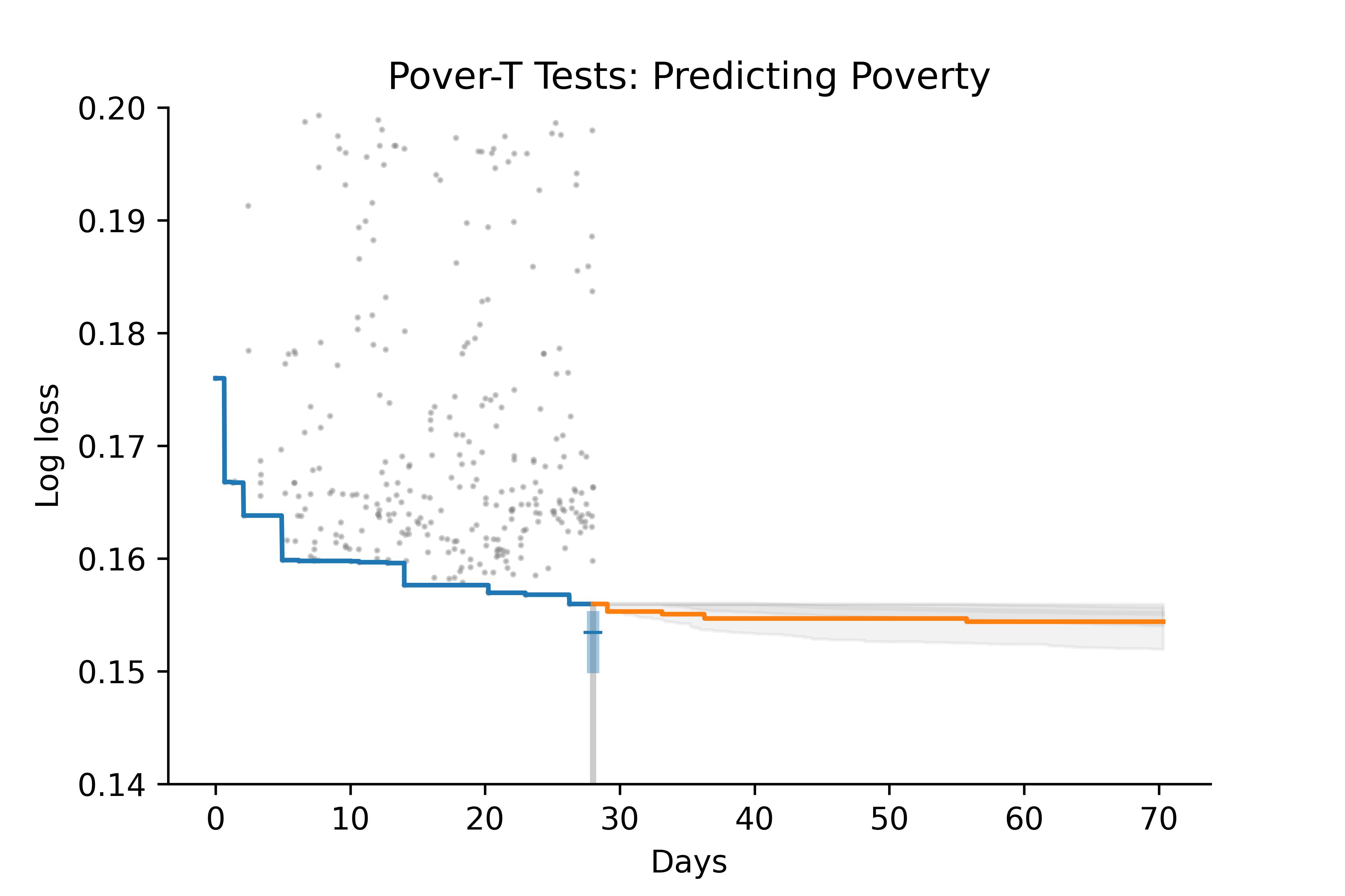
To see whether this hybrid model works, we tested it by using the data from the first 28 days of a competition to predict the rest. Here’s an example:
-
The gray dots show submissions during the first 28 days of the competition; the blue line shows the record progression.
-
The box plot at Day 28 shows the posterior distribution of
limit: the blue region shows a 50% credible interval, the gray line shows a 90% credible interval, and the blue marker shows the posterior median. -
After Day 28, the gray area shows the predictive distribution; that is, the rate we expect for future improvement.
-
The orange line shows the actual progress during the remainder of the competition.
Based on data from the first 28 days, the model estimates that the remaining room for improvement is modest, and it predicts that only a part of that improvement is likely to happen during the remainder of the competition. In this example, the prediction turns out to be about right. The winning score is close to the median of the posterior distribution, and the progression of scores falls near the lower boundary of the 50% predictive interval.
Of course, the model does not always do so well. Here’s a less successful example:
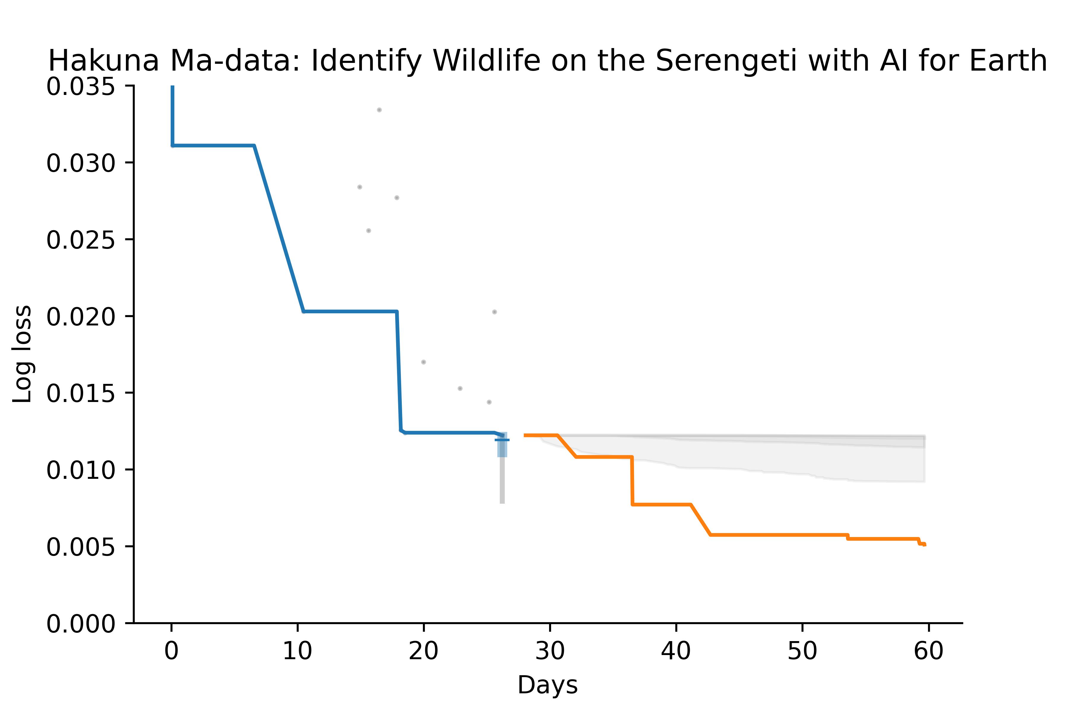
Based on data from the first 28 days, the model estimates that there is little room for improvement. But the actual progression of scores quickly drops below the bounds of both the posterior and predictive distributions. In this example, there were relatively few submissions during the first 28 days, so maybe it’s not surprising that the model failed.
But in general it does pretty well. Out of 10 competitions we tested:
-
In 8 cases the winning score falls within the 90% posterior CI.
-
In 7 cases the actual progression falls within the 90% predictive CI.
This is not yet a rigorous evaluation of the model, but if we take these as preliminary results, they are promising.
What is this good for?
If the approach we’ve proposed holds up to further scrutiny, it would be useful in two ways. First, we could use it to estimate the upper bound on the performance of a predictive model, which is sometimes the answer to a scientific question. For example, in the penguin experiment, we could use this estimate to quantify the degree of sexual dimorphism in different species.
Second, we could use the model to guide the allocation of research effort. If people have been working on a problem for some time, and we keep track of their best results, we can predict whether further effort is likely to yield substantial improvement.
For example, the following figure shows the progression of scores, from 2011 to 2022, for the ImageNet Large Scale Visual Recognition Challenge. The y-axis represents accuracy, so higher is better.
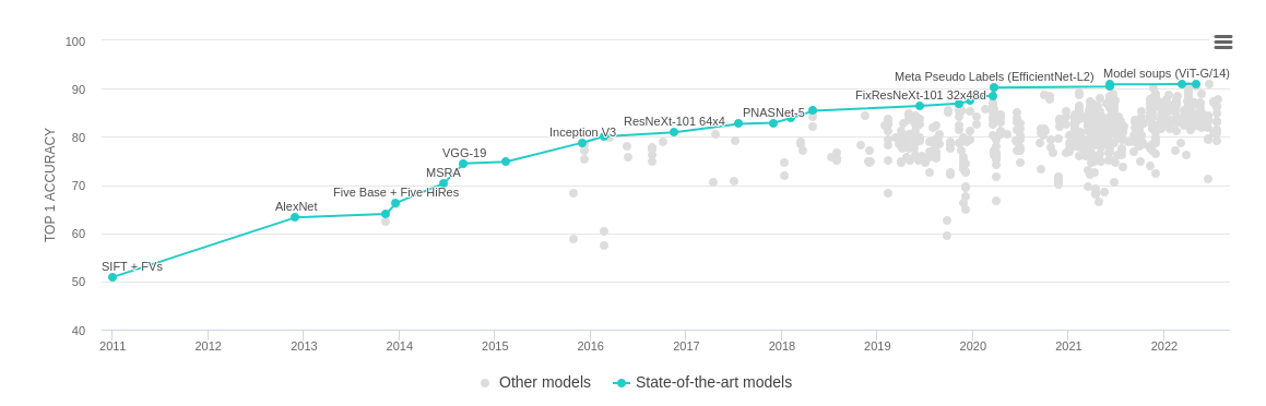
Suppose you were looking at this figure in 2017, when the best accuracy was close to 80%, and trying to decide whether to work on this problem. Looking at past progress, you might predict that there was more room for improvement; and in this case you would be right. In the most recent models, accuracy exceeds 90%. Looking at the same figure today, it is not obvious whether further progress is likely; the method we've proposed could use this data to generate a quantitative estimate.
This article describes our initial exploration of these ideas; it is not a peer-reviewed research paper. But we think these methods have potential.