Classifying New Zealand species
Zamba's African forest model was trained with almost 250,000 videos from 14 countries in West, Central, and East Africa. Although the species that appear in these videos are exclusively African, this model can be used to classify videos from other parts of the world that contain species the model has never seen. To demonstrate, we'll use videos collected by the Takahē Recovery Programme in New Zealand.
There are 3,056 videos in this dataset. The species that appears most often is the takahē, which is a flightless bird; the dataset includes several other bird species native to New Zealand, including kiwi, weka, and kea. The Zamba training set does not include any of these species, but it does include other birds. So let's see if Zamba recognizes birds it has never seen.
The following table shows the species that appear most often in this dataset and the categories Zamba assigns to them (that is, the total probability Zamba assigns in each category):
| blank | bird | rodent | antelope_duiker | mongoose | porcupine | other | |
|---|---|---|---|---|---|---|---|
| blank | 74% | 4% | 2% | 3% | 2% | 0% | 20% |
| takahe | 5% | 77% | 0% | 3% | 1% | 0% | 11% |
| weka | 6% | 44% | 0% | 7% | 1% | 1% | 27% |
| kiwi | 13% | 0% | 1% | 8% | 2% | 34% | 19% |
| kea | 11% | 14% | 1% | 6% | 2% | 0% | 54% |
| mouse | 32% | 2% | 28% | 12% | 3% | 2% | 10% |
| rat | 15% | 1% | 30% | 14% | 4% | 2% | 16% |
| possum | 17% | 1% | 1% | 23% | 10% | 1% | 35% |
| stoat | 21% | 3% | 1% | 5% | 9% | 0% | 38% |
Some of the results are promising. For videos showing a takahē, 77% of the total probability was assigned to the bird category, and for wekas, 44% of the probability. For the mice and rats, 28% and 30% were assigned to the rodent category.
But some of the results are less impressive. For the videos showing a possum, 23% of the total probability was assigned to antelopes. In the training set, antelopes are the most common species, so when a species is hard to identify, Zamba often guesses "antelope".
34% of the kiwis are classified as porcupines, which might seem strange, but if you consider these two videos, you might see the resemblance.
But even if some of these assignments are wrong, they could still be useful. For example, if you want to find videos containing takahē, you could use the targeted search strategy we described in a previous article.
-
If you select the 30 videos with the highest probability of containing a bird, 29 contain a takahē. Of the top 100 videos, 97 contain a takahē, and if you watched the top 1000 videos, you would find 822 out of the 1075 videos that contain a takahē, which is 82% of the total.
-
Similarly, if you watch the 30 videos Zamba gives the highest probability of containing a porcupine, you would find 22 that contain kiwis. And if you watch the top 100, you would find 45 of the 92 videos that contain a kiwi.
Probabilistic predictions can be useful even if the classification is not correct.
The blank/non-blank model
In addition to finding the species you are looking for, Zamba can also help you avoid watching blank videos. In most datasets, a substantial fraction of videos contain no visible animals, often because something else triggered the camera's motion sensor. Of the 3,056 videos in this collection, 470 are blank, which is 22%. As we can see in the table above, for videos that are actually blank, Zamba's African model assigns 74% of the probability to the blank category. So that's promising.
In addition to the African model, Zamba provides a "blank/non-blank" model (BNB) intended for just this use case. The BNB model is trained with 13,000 videos collected in European forests, in addition to the videos used to train the African model, so it has seen a wider variety of species and environments. It generates predictions for only two categories, blank or non-blank, which might be an easier task than identifying 30 different species.
We'll use the New Zealand dataset to see how well the two models identify blank videos. But first, let's compare their predictions. The following figure is a scatter plot showing the predicted probabilities from the two models.
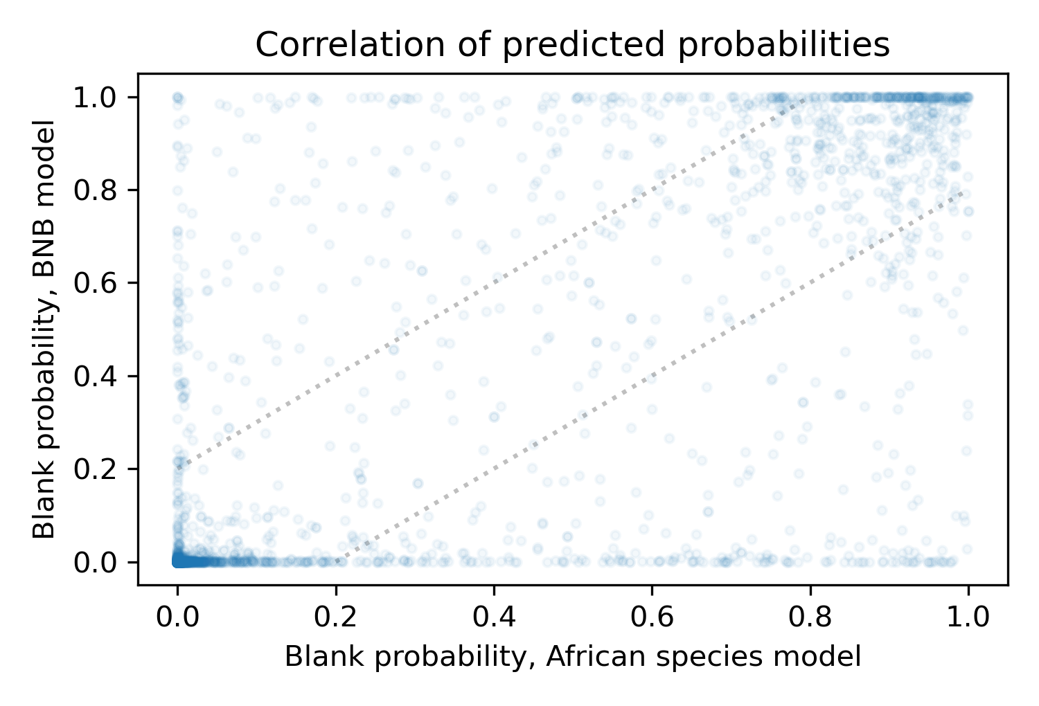
The area between the dotted lines indicates where the models approximately agree, but there are many points outside this area where the predictions are substantially different.
It might seem like a problem that the two models disagree so often, but it might be a good thing, because it suggests that the models have learned different ways to discriminate between blank and non-blank videos. If so, we might be able to ensemble them; that is, to combine their predictions in a way that is better than either alone. As a simple way of ensembling, we'll use the average of the two predictions.
Removing blanks
For each video, the models generate a probability that it is blank. If this probability exceeds a given threshold, we might conclude that the video is blank and discard it. But it is not easy to choose the best threshold. If the threshold is low, we discard most of the blank videos, but might lose too many of the non-blank videos we want. If the threshold is high, we keep most of the non-blank videos, but might not remove enough blanks.
To see what's possible, we'll start by sweeping through a range of thresholds and, for each one, compute the percentage of blanks we would remove and the percentage of non-blanks we would lose. The following figure shows the results.
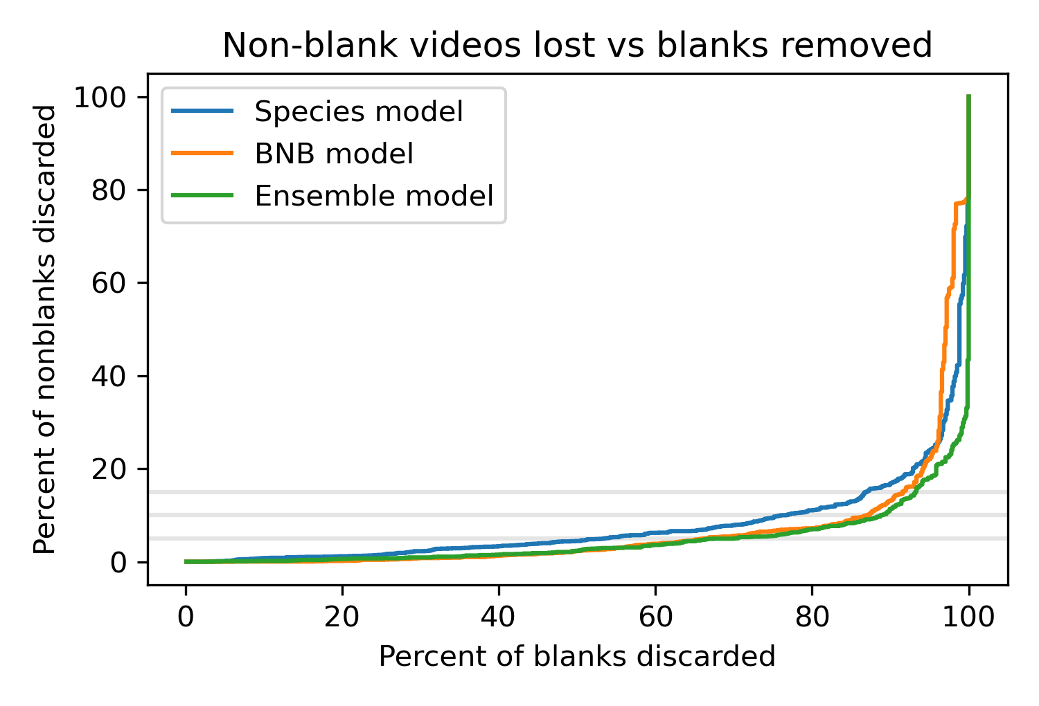
The x axis shows the percentage of blanks we can remove; the y axis shows the percentage of non-blanks we would lose.
The curves show the tradeoff between these outcomes for the African model, the BNB model, and the ensemble model that combines the predictions from the other two.
The gray lines show where we would lose 5%, 10%, or 15% of the non-blanks, which is a range researchers might find acceptable.
The best curve is the farthest to the right, where we can remove the highest percentage of blank videos for a given percentage of lost non-blanks. The results show that the BNB model is better than the African model (except in the upper right, where the loss rates are unacceptably high anyway). And the ensemble model is a little better still. For example, if it's acceptable to lose 10% of the non-blank videos, with the African model we can remove 77% of blanks; with the BNB model we can remove 87%; with the ensemble model, we can remove 89%.
These results are useful for comparing the models, but we can only compute these curves because we have labels for these videos provided by human viewers. That's not usually the case; in normal use, researchers are "flying blind", using Zamba's predictions to identify blank and non-blank videos without already knowing what's in them.
Choosing the threshold
In a previous article we proposed a strategy for choosing a threshold that removes blank videos while controlling the fraction of non-blanks that get lost. Applying that strategy to this data, with the target of losing only 10% of the non-blanks, we get the following results.
| % blank | prob blank | threshold | % blank removed | % nonblank lost | |
|---|---|---|---|---|---|
| African species | 22% | 26% | 0.29 | 88% | 15.8% |
| BNB | 22% | 25% | 0.11 | 92% | 15.7% |
| Ensemble | 22% | 26% | 0.36 | 92% | 13.4% |
The actual percentage of blanks is 22%; using the predictions from the models, we estimate that the probability of blanks is 25-26%, so that's a little high. On the positive side, we're able to remove 88-92% of the blank videos, but we lose more non-blanks than intended. Instead of the target loss of 10%, we lose more than 15% of the non-blanks with the African and BNB models, and more than 13% with the ensemble model.
This is typical of what we've seen in other datasets: the results are good, but the actual loss rate can be substantially different from the target.
We might be able to do better. The algorithm for choosing threshold depends on the calibration of the predicted probabilities; if we can improve the calibration, the algorithm should work better. And that's the topic of the next article.
What's a takahē?
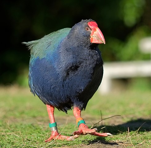
Image source: WikiMedia Commons
The South Island takahē is a flightless bird native to New Zealand. After 1898, it was thought to be extinct, but it was rediscovered in 1948. With an estimated population of only a few hundred, it is an endangered species, which is why the Takahē Recovery Programme works "with a network of people around New Zealand, to ensure the takahē is never again considered extinct." If you would like to help, please consider sponsoring a takahē
Thanks to our collaborator at the Takahē Recovery Programme for the use of the data in this case study and for helpful conversations toward the preparation of this article.


